Primary Bedroom Makeover
Updated: Aug 30, 2021
How to create that calm retreat you’ve always dreamed of
I remember just shy of 7 years ago, we moved into our new construction home. I was 39 weeks pregnant, ready to pop, and there we were moving from our 3 month rental apartment into our current home. To say that there was a lot going on was an understatement. A few days after our move, our second son arrived and we couldn't have been happier. Once we settled into a routine with our newborn, we fit in decorating the house in our 'down' time. Room by room we painted and added decor, slowly turning the new house into our home.

It finally came time to update our main bedroom and at the time, we had our baby sleeping in the room with us so the update had to be quick and non disruptive to that precarious newborn schedule. I had just discovered wall stencils and decided to paint a Moroccan trellis pattern on the wall behind the bed. Since I was in a house full of boys, I was determined to have my slice of pink and my husband obliged. You don't mess with a postpartum mom. I painted the accent wall with a base coat of a beautiful dusty pink and then painted the pattern in a color a shade lighter and in a sheen shinier. I painted the rest of the walls beige, my husband built floating shelves to flank our TV mounted on the wall opposite the bed and we updated the overhead light fixture. That was the extent of our decorating. No curtains, no pretty vignettes - all business.

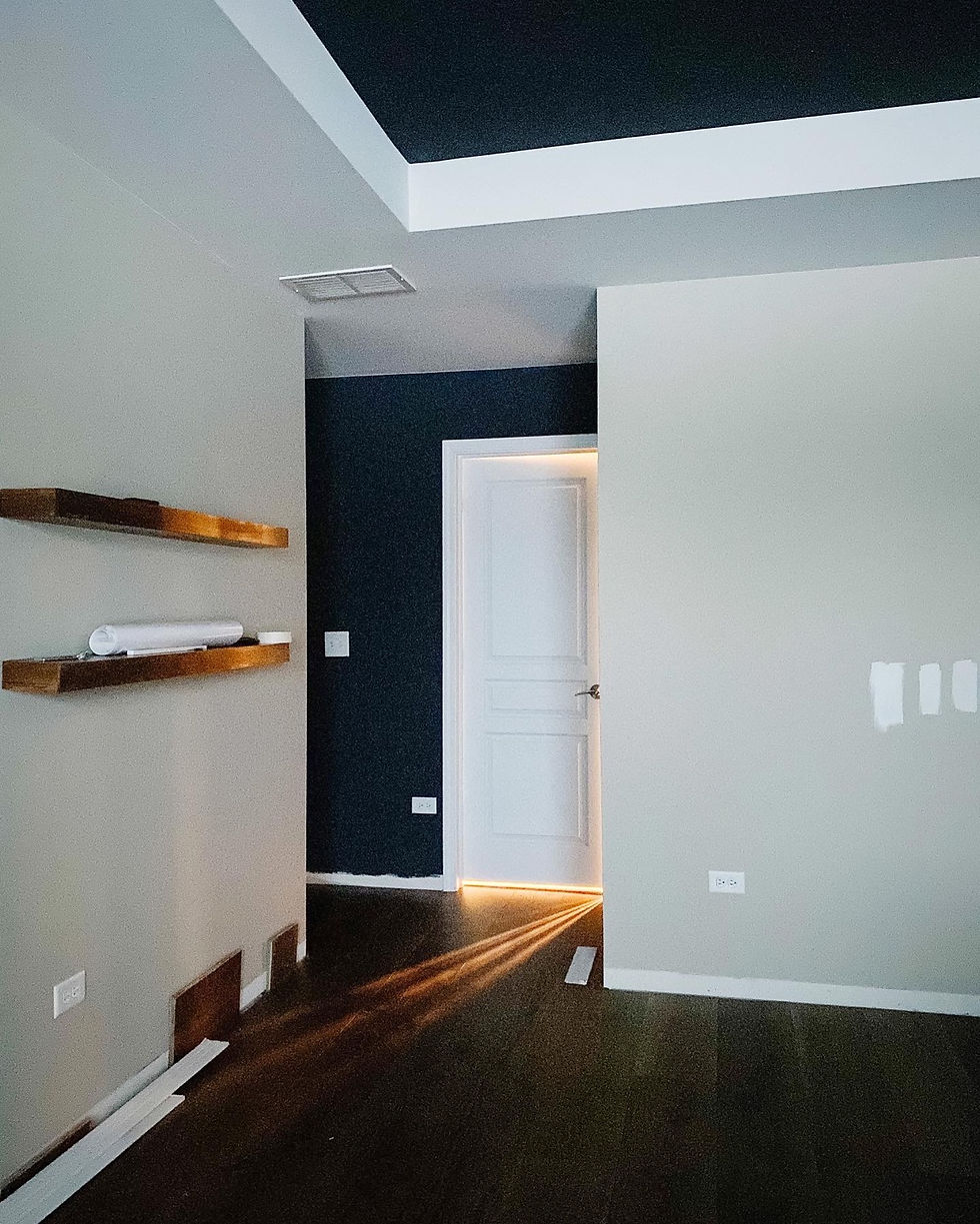
This year, fully committed to updating each space in our home, I turned my focus to our bedroom once again. We were in the middle of updating the flooring on our second floor and our bedroom had just had the new wide plank engineered hardwood installed. That kickstarted the room overhaul. We have a tray ceiling in there that was begging for some definition and interest. What better way than to paint it a bold color. Currently obsessed with the contrast between black and white, I decided the ceiling would be Wrought Iron by Benjamin Moore and the walls Silver Satin - complete opposites in name and in color but work together like a dream. In addition to the ceiling, our bedroom has a little nook of an entryway which I also used Wrought Iron to define.
My vision was coming to life. I often referred back to an inspiration picture from Studio Mcgee - aspiring to achieve that same feeling in my own bedroom. Light and airy yet warm and interesting - encouraging your eyes to travel from one curated corner to another. I created this moodboard so I could always refer back to my original plan.
I wanted to add more interest to the walls without overpowering the room with color and decided on picture frame molding on all walls except the one with the TV. I installed the picture frame molding "backwards" with the tapered edge of the molding towards the exterior of each box. I debated changing it to the more traditional orientation after nailing one box on the wall but resisted the urge and finished the whole room with this unconventional look and I'm glad I did. Once it was all installed consistently throughout the room, it looked seamless and beautiful just the same. Adding picture frame molding is the perfect way to add elegance to a space without being stuffy. Painting it the same color as the wall adds character to large blank walls without attracting all the attention.
The molding pattern for the wall behind the bed took some time to figure out. Because of the square footage of our room, our night stands and bed are stacked close to the window wall leaving enough room at the other end of the room for a couch. Having a couch in the bedroom has always been a goal because I want a space to sit and chat with my husband at the end of the day. It also provides a spot to sit and work on our laptops. It's also nice to have a way to watch TV in our room without being forced to watch from the bed. In other words, I wanted to leave room for a couch and if I centered the bed in the room, I'd have a lot of dead space all along the perimeter of the room. So for the picture frame molding on that back wall, I was trying to create a layout that was centered with the room but also had a box centered with where the bed was going to be. That resulted in a pattern that had too many boxes too close to each other and would make everyone dizzy. I then had to commit to this furniture setup and create rectangles highlighting each nightstand and larger rectangles for the bed and couch area.
After the floors, ceiling and walls were done, I focused on adding decor in slowly. Throughout the room I used gold accents balanced by wood or more muted elements - brass curtain rods with velvet curtains, brass light fixture with linen shades, shiny wall sconces over the nightstands balanced by an earthy urn with delicate white stems. It's this balance that makes a room really shine and provides that cause for intrigue when you least expect it.
What is your favorite part of this room makeover?


Comments